HiCloud
Your personalized guide to cannabis wellness
HiCloud helps new and curious users explore cannabis with confidence. Through personalized strain matching and an education-first experience, HiCloud supports users at every step of their journey — stigma-free.
Team
Solo
Role
UX & Product Designer
Timeline
7 Months
(SEP. 2021 - APR. 2022)
Tools
Figma, Illustrator, Photoshop, HTML, CSS

The Challenge
Cannabis is becoming more accepted, but access to guidance hasn't caught up. Many new users feel overwhelmed, confused, or unsure how to start, especially when trying cannabis for health or wellness.
Most tools focus on transactions. Very few focus on education or trust.
Insight from Research:
“I want to try cannabis, but I don’t know where to start — and I don’t want to feel judged.”
"How might we help people make safe, informed, and stigma free cannabis decisions?"
Project Goals
Help users discover strains based on their needs and comfort level
Personalize learning based on experience level and intent
Build trust through accessible design and non judgmental language
Focus on safety, clarity, and harm reduction
Understanding the Users
To guide this experience, I interviewed 8 users and surveyed 30+. I focused on first-time, wellness, and medical users to understand their fears, goals, and expectations. I defined four key user types based on my findings:
New cannabis users
Recreational users
Heavy users
Medical users
Each persona was supported by a user journey and storyboard to visualize motivations, behaviors, and challenges.

🌱 New Cannabis Users
No prior experience
Curious but anxious about effects or dosage
Needs simple, digestible learning paths

🌿 Recreational Users
Casual, social users
Interested in discovering new strains or formats
Needs recommendations based on intent or mood

🔥 Heavy Users
High tolerance, regular consumption
Wants to refine or better understand product effects
Needs advanced tips or tracking tools

💊 Medical Users
Uses cannabis to manage pain, sleep, anxiety
Needs evidence-based guidance and responsible consumption strategies
User Journey
I created a user journey in order to get a better idea on what scenarios the users might face as well as what assumptions and goals they might have from their experience.

🌱 New Cannabis Users

🌿 Recreational Users

🔥 Heavy Users

💊 Medical Users
Storyboard


🌱 New Cannabis Users
This storyboard follows Amy's journey of obtaining cannabis products for herself at the recommendation of her friends. She looks up the website for more information on cannabis but ultimately goes into the store in order to learn more about the products from one of the budtenders at the dispensary.

🌿 Recreational Users
This storyboard follows Raihan on his journey to try new cannabis products. He uses a centralized cannabis website to get all of his information. This website is where LPs and dispensaries can direct cannabis users for information on the products they would be consuming.


🔥 Heavy Users
This storyboard follows Wilhem on his journey to learn a bit more about cannabis. He is a skeptical and heavy cannabis user. He thinks all cannabis is the same, but he ventures out on what he thinks he knows and educates himself regarding cannabis with the use of a centralized website regarding cannabis products.


💊 Medical Users
This storyboard follows Olita on her journey to find a suitable product to de-stress and for anxiety due to her job as a paramedic. She is recommended by one of the budtenders to download an application in order to look up information on the products sold across all dispensaries in Ontario.
🔑 Key themes:
- Most users don’t know what strain or format to try
- They’re scared of dosing wrong or having a bad experience
- They want friendly guidance — not a wall of jargon
Research Strategy
Primary Research
Conducted user questionnaires (30+ responses)
Facilitated 1-on-1 interviews across all four user types
Ran prototype usability testing with moderated feedback
Integrated user suggestions to refine language, layout, and features


I sent users my application prototype for user testing and gave them a feedback form that had 5 questions asking generally how they find the application. Majority of the users find that the application is very simple to use and straight forward. Majority of the users also suggested some more features for the application like adding cannabis accessories, having the look more ‘weed’ related, product recommendations, an educational page explaining terms used etc.
Secondary Research
Studied competing cannabis apps and dispensary experiences
Reviewed educational content around dosage, formats, and effects
Audited accessibility and content design best practices
Professional Collaboration
Worked with a licensed cannabis producer to ensure regulatory alignment and content accuracy
Ensured guidance aligned with safe usage principles and non-medical disclaimers
Key Research Insights
Worked with a licensed cannabis producer to ensure regulatory alignment and content accuracy
Ensured guidance aligned with safe usage principles and non-medical disclaimers
Insight
What it means for design
Users feel overwhelmed by jargon and options
Create a quiz or entry point to guide discovery
People prefer learning in private over talking to staff
Keep the tone supportive, not clinical
Trust is hard to earn, especially around cannabis
Use familiar UI patterns, simple language, and no marketing jargon
Intent-based usage is more relatable than strain names
Allow users to browse by goals like “sleep” or “relax”
Defining the MVP
✅ Must Haves
Beginner quiz to guide discovery
Browse by intent, not strain names
Simple, readable product education cards
Glossary of common terms for confidence building
❌ Out of Scope (for now)
User login/profiles
Social/community features
Dispensary integration or purchases
🎯 Why: I focused on a tight MVP that could actually be built, tested, and scaled for one person. Further scope requires more time and a team.
Design Process
HiCloud's visual design is clean, calm, and informative, built to earn trust in a stigmatized space.
🌟 Core Screens
Onboarding Quiz: Determines experience level and guides user
Intent-Based Discovery: “I want to relax / sleep / boost focus”
Strain Learning Cards: Format, effects, dosage tips
Wireframes
Sketched out key flows: home, quiz, explore, learn, education cards
Focused on readability, white space, and mobile-first navigation

Screens & UX Flows
Personalized Flows for Real User Goals
Each screen is designed to help users feel informed, supported, and in control from the moment they open the app to their first saved match.
Quiz Flow: Getting to Know the User
HiCloud begins with a 3-step quiz that asks users about:
1. Their experience level
2. What effects they want to feel
3. Their preferred product format
Instead of overwhelming users with strain names, the quiz focuses on feelings, accessibility, and microcopy to build confidence.
Personalized Results
Each user receives a curated Top Match, followed by similar strains based on their answers. Every card includes:
- Effect tags (e.g. Relaxed)
- Type (Hybrid, Indica, Sativa)
- Flavor and usage format
Learning Hub: Cannabis, Explained Simply
- Effect tags (e.g. Relaxed)
- Type (Hybrid, Indica, Sativa)
- Flavor and usage format
Explore Flow: Browse Without Pressure
For users who aren’t ready to take the quiz, the Explore tab offers filters by effect, type, or format, all without requiring account setup or commitment.
FINAL DESIGN
HiCloud brings together everything I explored in research, UX thinking, and system design. These final screens represent the complete flow. From first tap to learning and discovery.

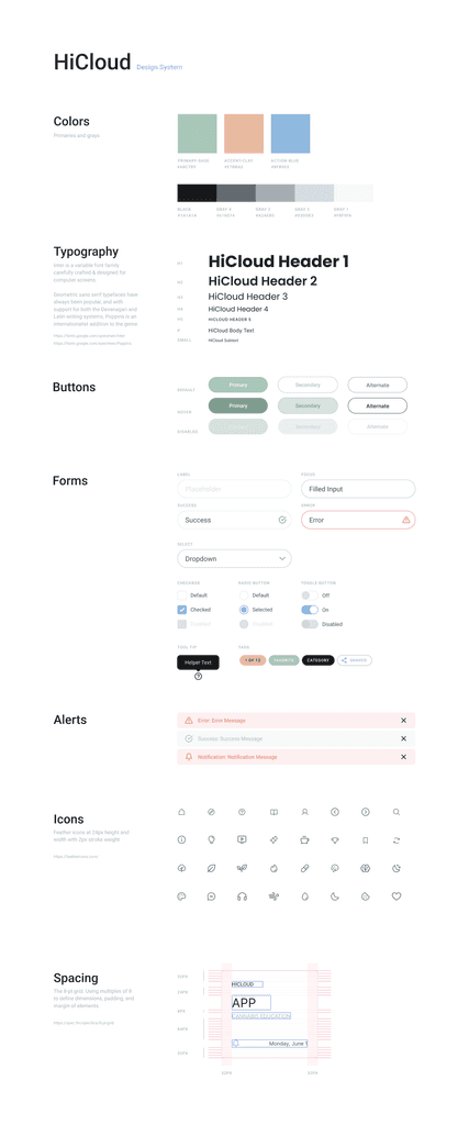
Visual System
HiCloud’s design system was built around soft edges, a muted palette, and accessible UI, creating a calm space for learning and exploration.
What I Learned
This wasn’t just a visual design project, it was a chance to build something deeply empathetic, structured, and systemized. It wasn’t just about UX or UI, it was about:
Making education accessible and stigma free
Prioritizing safety and self paced learning
Designing trust through every micro-interaction
Reflection
Here’s what I took away from building HiCloud:
How to scale from a thesis concept to a real product
The importance of systems thinking in UI
How to communicate tone through microcopy and UX
Designing for beginners = designing for clarity, accessibility, and trust
Iteration through feedback is everything
HiCloud taught me how to build with purpose — and how to connect users with solutions that genuinely meet them where they are.
What I'd Improve Next
Add accessibility features for neurodivergent and low-vision users
Localize content for different regions and legal frameworks
Partner with dispensaries or healthcare educators to expand learning tools
Track analytics to refine education paths and improve quiz accuracy
Add onboarding screens and flow
Add user profile page so users are able to see their matches and favourite strains
Why This Project Matters
HiCloud isn’t just about cannabis. It’s about building products that empower people to make informed, confident decisions — especially in spaces where trust is hard to earn.
Whether I’m designing for health, wellness, or financial literacy, I bring the same mindset:
research deeply, design responsibly, and simplify complexity.